Carrd: The Making Of
By @ajlkn | March 27, 2017
If you know me, you know writing isn't my thing. Like, at all. A tweet is about as much as I can handle these days.But I promised everyone — myself included — that I'd eventually sit down and thoroughly document the entirety of my experience building Carrd, the (at least as of this writing) biggest and most ambitious solo project I've ever taken on.And so, a year since launching it, here I am 😄This writeup — which FYI is a bit on the long side — will walk you through the entire story behind Carrd from conception to launch, as well as attempt to explain some of the major (concept|design|dev) decisions I made along the way.
Who am I?
First, for those who have no idea who I am, a brief summary:- I'm AJ (@ajlkn on Twitter).
- I'm based in Nashville, Tennessee, USA.
- I've been designing and developing stuff for the web since the mid-2000s.
- I'm mostly known for building HTML5 UP, Pixelarity, and a handful of projects over at GitHub.
- I indent with tabs.
- I pronounce "gif" with a hard "G".
What is Carrd?
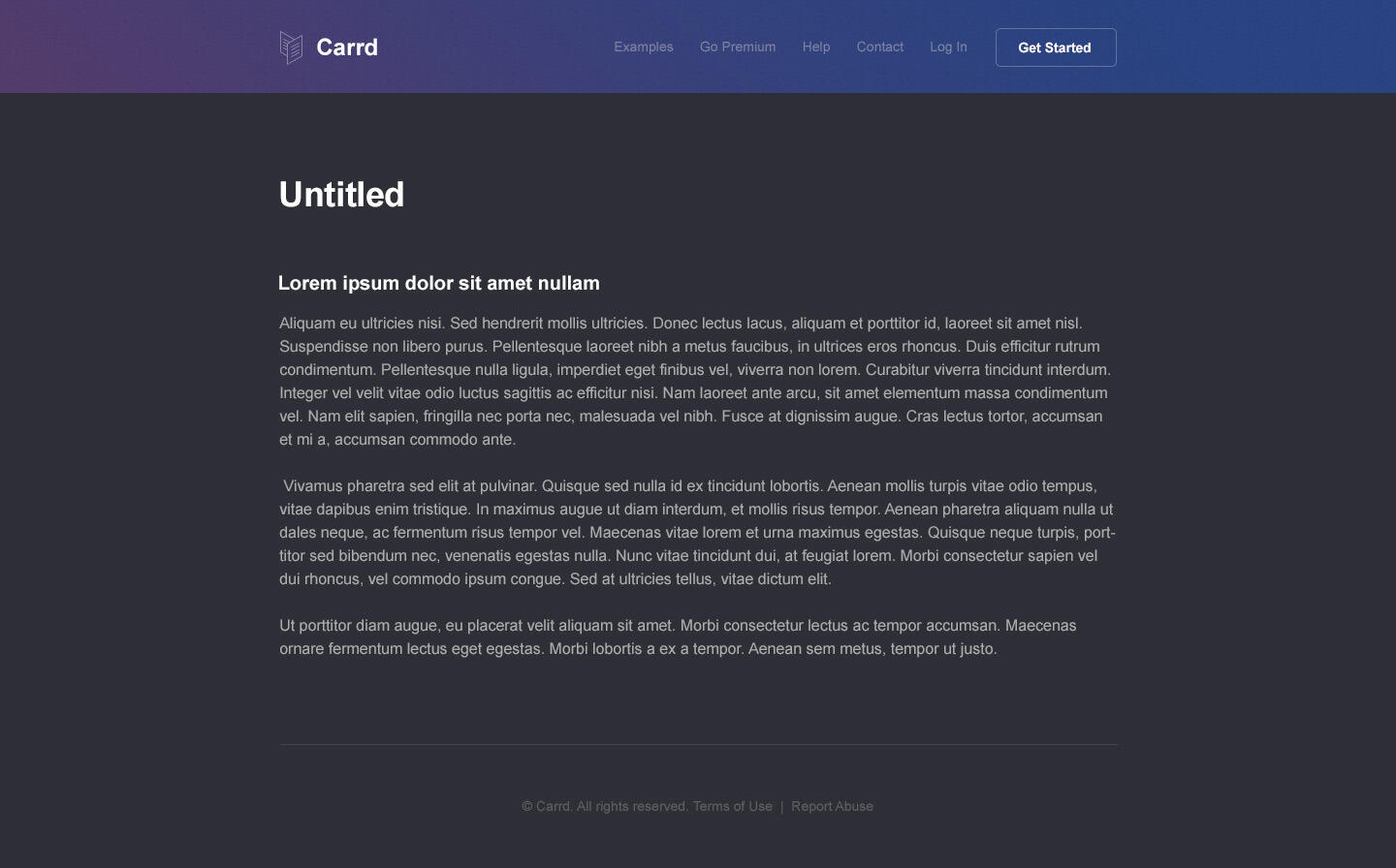
Carrd is a platform for building simple, responsive, one-page sites for pretty much anything, whether it's a personal profile, a landing page with a MailChimp signup form, or something a bit more elaborate. It's fast, flexible, simple to use, and 100% free.
Choose a starting point or start from scratch
Customize and go live in minutes (or in this case under 30 seconds 😀)
Haven't tried it yet? Head on over to carrd.co/build to get started (no signup required).
And you're caught up, though you might be wondering why I chose to build Carrd in the first place ...
The Plan
Two years ago, I decided it was time to do something different.Random projects aside, my work experience up to that point basically came down to two things:- Designing and coding site templates, and ...
- Building sites to distribute them (both free and paid).Which, despite being an incredible learning experience — and one that taught me practically everything I know about design and frontend/backend development — was something I had been doing in one form or another for literally years, to the point where it became so easy it almost felt ... routine.So, I figured it was time to branch out and try something new.

The question was what?
The Idea
Answer:

Apparently doing the same two things over and over seriously impacted my ability to come up with "outside the box" ideas, and what few I did come up with were either too boring or just too damn cliché (yes I considered doing a to-do list app 😅).So, perhaps the solution was to not think too far outside the box, and instead stick to the same general category as all my previous work — that is, web design, and specifically the "do-it-yourself" variety found in site templates.And that's when it hit me: how about a site builder?Not only would this be a fun challenge (and one that would encompass both the frontend and backend), it also felt like the next logical step after years of making increasingly sophisticated site templates that were kind of edging towards proto-site builder territory anyway.Of course, this being a solo project, building something on the scale of a Wix or a Squarespace was obviously off the table, so I decided to focus my efforts on simply targeting a specific niche. The question of course was which niche (heh), so after a bit of research I narrowed it down to these four:- Portfolio
- App landing page
- Blog (specifically a microblog-style thing)
- Profile (basically an online "business card")And while they all had potential, Profile felt like the best fit:- It was simple. As in, one-page simple, with usually just a photo, some text, a few links, and maybe a background image. Which was awesome, because that simplicity could be reflected at every level of the site builder — from its UI all the way to its backend.
- It had wide appeal. Unlike the other three niches, this one wasn't limited to a specific audience. In fact, it was open to pretty much anyone wanting a basic presence on the web (= a lot of people).
- It was popular. Two of the most popular downloads at HTML5 UP, Aerial and Identity, were one-page profile templates, which I found a bit surprising until I began running into them everywhere and saw how well they worked in practice.So I had my idea: a site builder for creating simple, one-page profile sites.
The Concept
Now that I actually knew what I was going to build, I sat down and defined some basic objectives for it:- Easy to use. From the site builder experience itself to the more mundane stuff, it needed to prioritize ease of use over practically everything else. Obviously this was easier said than done, but the product's narrow focus meant there was — short of me royally screwing up 😅 — a natural limit to its complexity.
- Fast. As in, capable of cranking out a gorgeous site in under 5 minutes. Not because I wanted users to spend less than 5 minutes on their sites, but because it would mean the site builder was so streamlined they absolutely could. Even though they shouldn't. But they could.
- Free (with optional paid plan). Yup, absolutely free, with extra features locked behind a paid upgrade. This would give the product its widest possible audience and, at least in theory, translate to not only more feedback to actually improve the product, but also potentially more upgrades to the paid plan.
- No signup required. Users would be able to jump right in to the main site builder experience without having to sign up, and only be prompted for an email/password when the time came to actually push a site live. This would make trying the product super easy as well as maximize the effect of a feature on something like Product Hunt (which I'll get to later 😄).
- Mobile-friendly. And I didn't just mean the sites — I meant the site builder itself. Few site builders were capable of doing this at the time, so I figured it'd be a good way to make mine stand out.Next, I shifted my focus to the actual sites that would come out of this thing. Like with the site builder itself, I started by defining some objectives:- Simply built. They had to be constructed in such a way that a basic, super simple UI would be enough to put them together (and put them together fast).
- Customizable. There had to be just enough in the way of customization to make each site unique, but not so much to make the process overwhelming or confusing.
- Responsive. And because it wasn't 2006 they obviously had to be fully responsive (ideally with little to no effort on the part of the user).I then moved on to figuring out how I'd actually achieve these objectives, so after some intense brainstorming I came up with a "specification" of sorts (AKA the "site spec") that, at least on the face of it, seemed to do the job. Here's how it broke down:- Make every site a simple "stack" of elements. While this effectively limited each site to a single basic layout, profile sites usually followed some variant of this pattern anyway. Plus, its sheer simplicity meant practically everything (from handling responsiveness to the site builder UI itself) would be significantly easier to pull off.
- Let users choose the stack's position on the page as well as the alignment of its elements. Simple customizations, but ones that would add some much needed variety to my otherwise one-note stack pattern.
- Give users the tools to heavily customize everything else. That is, go beyond the stuff you'd usually expect. For example, in addition to choosing a text element's font, size, and color, allow users to tweak more advanced stuff like casing, line height, and letter spacing. Same deal with the page background: allow the use of not only solid colors and images, but also custom gradients and advanced features like gradient overlays and granular image positioning/sizing.Now, this all looked great on paper, but how would it play out in practice? Would all the "heavy" customization options be enough to offset the stack pattern's limitations, or would every site still end up looking more or less the same? And what about responsiveness? Would the stack really make this as easy as I thought, or was I missing something glaringly obvious?All good questions, and ones I absolutely needed to answer before moving on to anything else. So, I decided to do a dry run, which basically amounted to hand-coding a few test sites in strict observance of my fledgling site spec.And much to my surprise, the results were good. Really good:
- First, while the stack definitely limited my layout options, everything else was juuuust customizable enough to still make each site look and feel entirely unique.
- Second, responsiveness was indeed trivial. The stack pattern worked so well across every screen size that I barely had to change anything beyond the superficial (eg. font size) to sucessfully "responsify" each site.
- And finally, even after making everything responsive, the resulting HTML and CSS turned out to be ludicrously simple — like, literally just a handful of tags and rules — making the eventual job of actually generating (and later manipulating) the code of each site much, much simpler.... at which point I distinctly remember thinking:"Holy shit, this might actually work."There was, however, one last thing I needed to figure out ...
The Name
Yes, I needed to pick a name for this thing, but I knew that wasn't going to be easy given the constraints unique to this product:- It had to look good — in a URL. And not just its own. Since domains were going to be optional (and probably only available with the paid plan), the vast majority of users' sites would end up hosted at a "subdomained" URL like janedoe.domain.ext or foo.domain.ext, so whatever I picked for the "domain.ext" part kinda mattered more than usual.
- It had to be unique. The name obviously had to be unique and memorable enough to form the basis of a brand, but ...
- It couldn't be too unique. Again, since this name was going to show up in URLs belonging to users, it had to be low key enough to not stick out.
- Finally, the domain obviously had to be available (or at least for sale for a non-crazy price). Preferably as a .io, a .co, or some other trendy two-letter extension to keep it as short as possible.However, much to my (pleasant) surprise I actually came across enough decent names to put together a shortlist of three good candidates I could then evaluate in depth:slates.io
- Pros: Short, memorable, brandable, and very low key.
- Cons: Plural noun, which meant it was easily confused with its singular counterpart, slate.io (which, while for sale, was just a bit on the pricey side — $10,000 😲).
- Verdict: 👎carrd.io
- Pros: Shorter than slates.io, memorable, brandable, even more low key, no plural/singular issue, and "Carrd" was a nice play on "business card".
- Cons: Literally sounded like "cardio", which I suppose would have been awesome if I were building an exercise or fitness app. But yeah, I wasn't.
- Verdict: 👎carrd.co
- Pros: All the benefits of carrd.io with none of its fitness baggage.
- Cons: Had a .co extension, which unfortunately meant potential confusion with its unavailable† .com counterpart, carrd.com. Still, I really liked this name, and as it hit practically every one of my requirements (and then some), I decided this particular "con" was one I could live with.
- Verdict: 👍And so, on April 30, 2015, I registered carrd.co and finally gave my site builder a name: Carrd.† Later, I would actually reach out to the owner of carrd.com and, after a brief email exchange, agree to buy the domain for the (IMO fair) price of $2000, which I then used to set up a wildcard 301 redirect (*.carrd.com → *.carrd.co) and eliminate the whole .co/.com problem once and for all 😎
And now, the fun part.
Building Carrd

Carrd was clearly going to be a huuuuge project (at least relative to anything I had done in the past), so to make the whole thing less intimidating I divided it up into five smaller "subprojects" I could tackle one at a time:- Generator: The backend component responsible for generating the HTML and CSS of each site.
- Builder: The visual, browser-based UI that interacted with the generator.
- Dashboard: The UI for managing one's sites, account, and all that fun stuff.
- Site: The Carrd site itself, including its logo, branding, landing page, etc.
- Paid Plan: Everything needed to process payments and subscriptions for Carrd's paid offering (whatever that ended up being).
The Generator
As the thing that actually generated the HTML and CSS of each site, the Generator was literally the heart of the project and so the most logical place for me to start. Working on this first would also allow me to fully develop my still-fledgling site spec which, despite looking good on paper and in my dry run tests, had yet to be tested with a real implementation.
Going Static
First, I needed to figure out how the Generator was actually going to do its thing — specifically, how it would take a high-level request (eg. "write this title in red over here and put this image over there and make it 200 pixels wide") and translate it into the requisite HTML and CSS needed to fulfill that request (eg. an h1 tag followed by an img tag, and two CSS rules to style them as requested).So after a bit of planning I decided the best approach was to design it like a static site generator, meaning it would take a set of "source" files as its input (which, among other things, would define the site's appearance and content), and produce as its output 100% static HTML and CSS files. This approach had a number of nice benefits:- Simplicity. Each site would be, when generated, simply a collection of static HTML and CSS files with no server-side scripts or code.
- Performance. The absence of server-side code meant sites could be lean, lightweight, and require very little in the way of resources, which meant better performance and ultimately lower runtime costs.
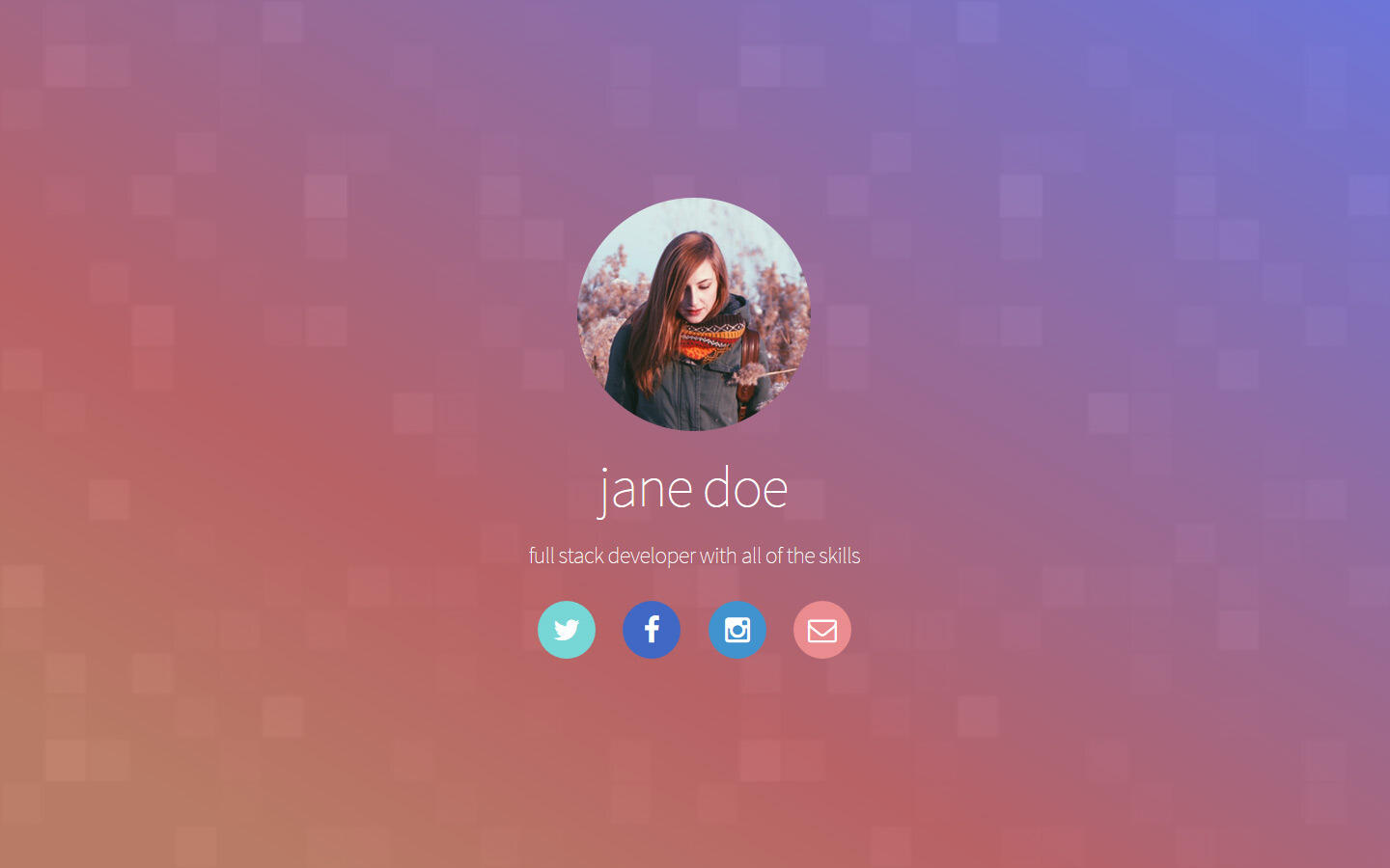
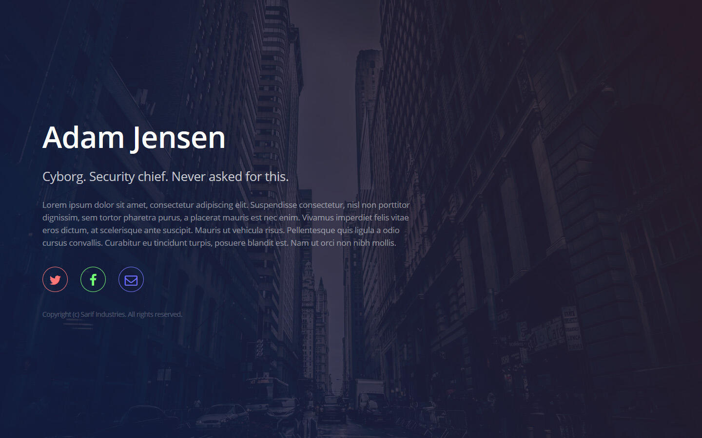
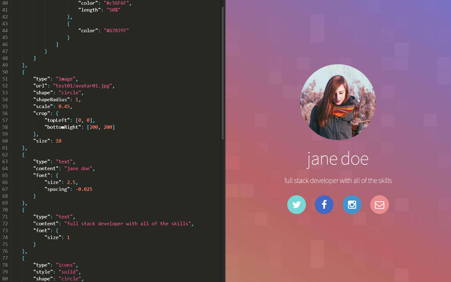
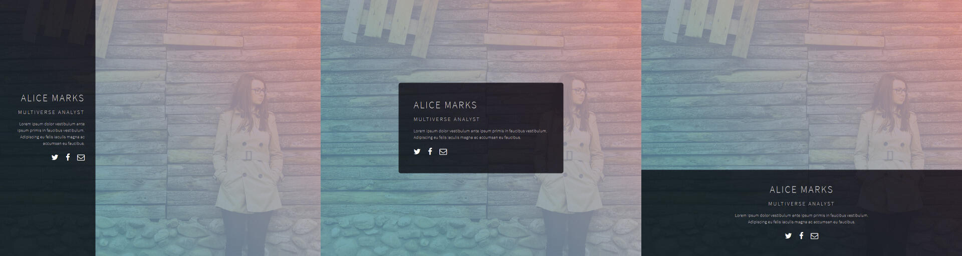
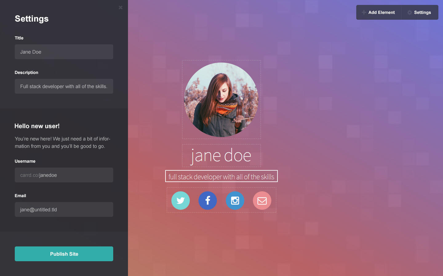
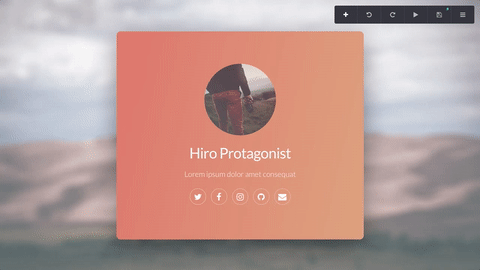
- Portability. Being static also meant the generated sites would be completely independent of Carrd itself, meaning if I ever outgrew my capacity it wouldn't take much to migrate site hosting duties elsewhere.As for the actual source files: I settled on representing each site with a single JSON configuration file and an optional "assets" folder for images/other random assets. This kept things simple, meshed well with both the frontend and backend, and, thanks to JSON's readability, made it super easy to iterate on the site spec throughout the development process.And so after a few hours of coding, I managed to hack together enough of a prototype to fully reproduce my "Jane Doe" test site from nothing more than a simple JSON config and a folder of images:
... which was awesome, because it validated both the general direction of my site spec as well as my decision to go static. I then moved on to refining my hacked-together prototype into what would eventually become the foundation of the real Generator ...
Carrdgen
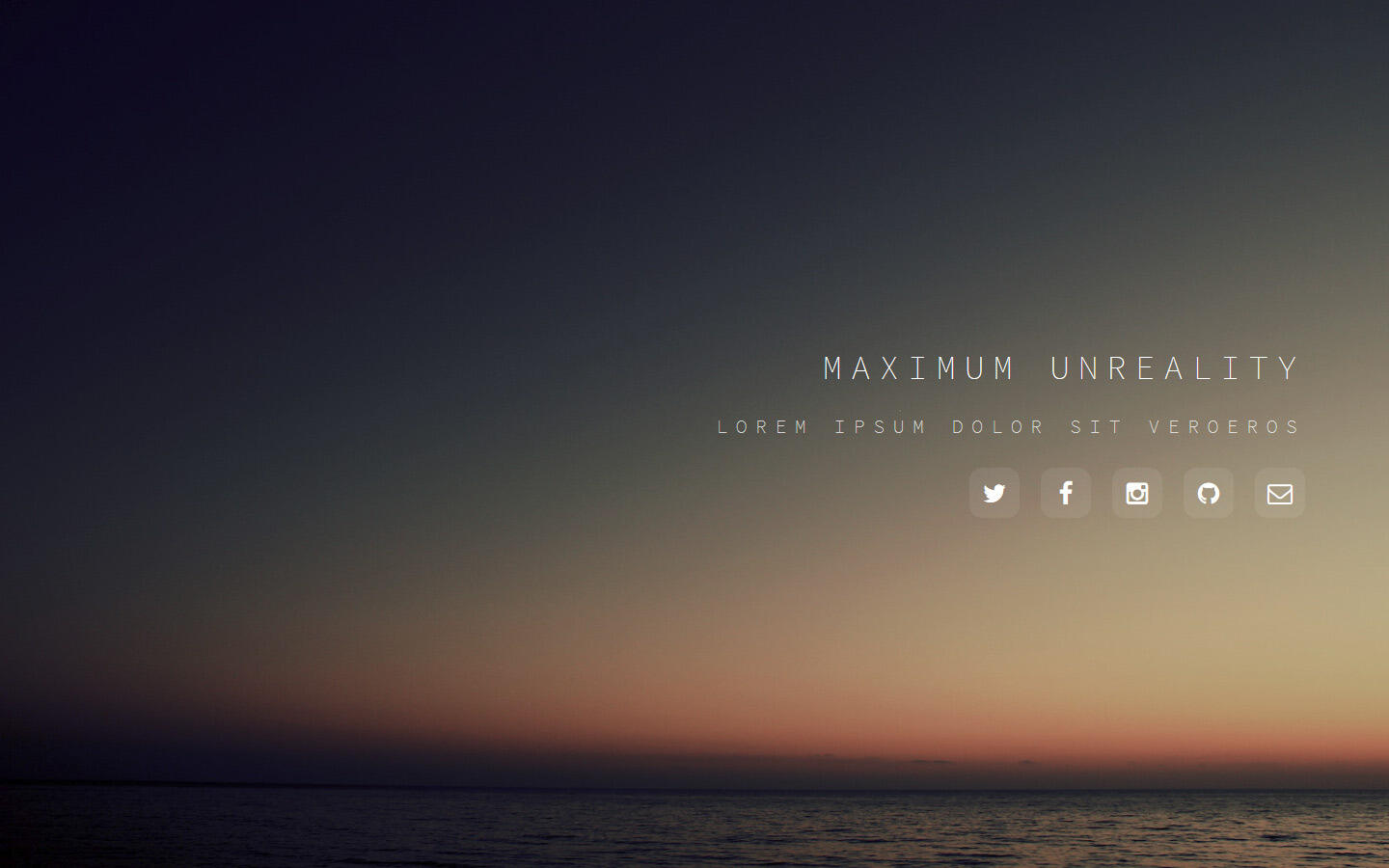
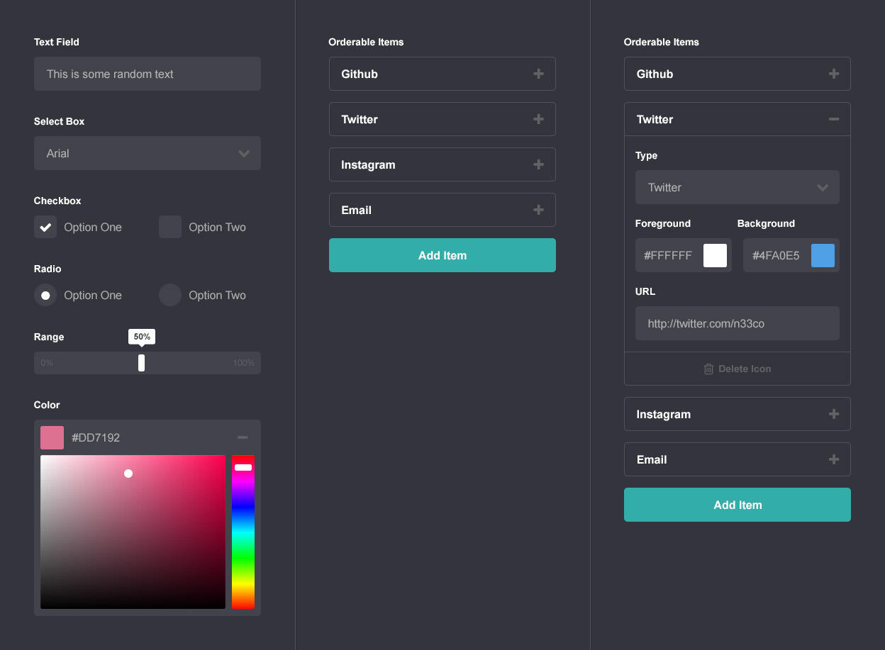
Carrdgen was an improved version of my prototype paired with a simple frontend to make working on the site spec more convenient, and it was through this that I was not only able to greatly improve the site spec, but also make two very fundamental changes to Carrd itself:First, it became clear the "stack of elements against a background" thing was a bit more limiting than I originally thought, so I extended the spec to allow users to not only choose the position/alignment of the stack, but also whether to optionally wrap it inside either a box, a "wide box" that spanned the width of the page, or a "tall box" that spanned the height of the page. This relatively minor addition resulted in a ton of new customization possibilities while remaining true to the stack pattern:
And second, it also became clear that Carrdgen was capable of far more than just simple, one-page profile sites. It actually seemed pretty good at creating simple, one-page sites for, well ... almost anything. So good, in fact, that I decided to go ahead and make it official: Carrd would no longer just be a one-page profile site builder, but instead ...A one-page site builder for pretty much anything.

Following these two changes, I finalized the site spec, wrapped up work on Carrdgen (which by then had evolved into its final form as the Generator), and moved on to the next piece of the puzzle: the Builder.
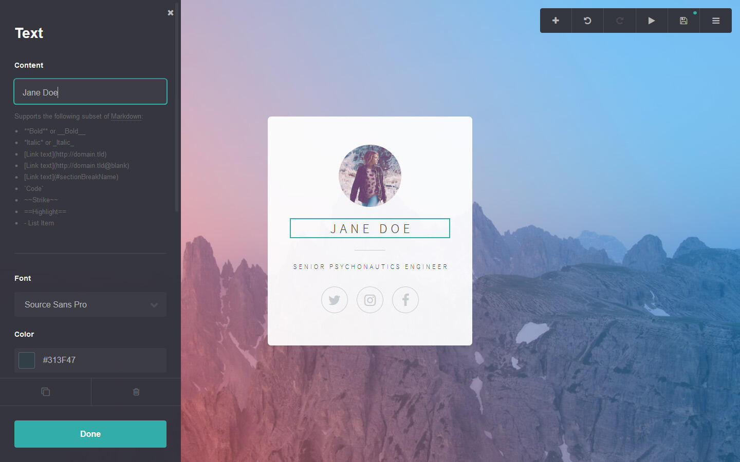
The Builder
This was the big one. The Builder was more than just the frontend to the Generator; it was the core experience of the entire product. How good the Generator was or how much cool stuff you could do with it literally meant nothing if its primary means of interaction did a shitty job of getting that across.In short, it had to be awesome, so with that in mind I laid out my goals:- Minimal. In terms of both style and interface. The main focus should, after all, be the site being built, so there should be as little UI on the screen as possible.
- Self-explanatory. New users should be able to jump right in and get started with little to no explanation. This meant having very clear/obvious paths to get around the UI as well as making everything behave the way users generally expect (eg. being able to rearrange elements via drag and drop).
- Lightweight. Meaning once loaded, it should be able to operate largely independent of the backend, improving responsiveness (in the traditional sense), reducing bandwidth, and reducing the overall load (and runtime costs) on my end.
- Mobile-friendly. Because being minimal, self-explanatory, and lightweight wasn't crazy enough 😅
And now came the fun part: actually designing this thing.
Pushing Pixels
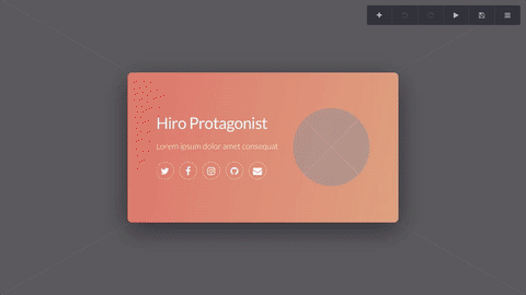
Truth be told, I already had a general sense of how I wanted things to look waaaaay back when I first conceived of the project in early 2015:
Hell, I even did a quick mockup before even starting work on the Generator (yes I was that excited):
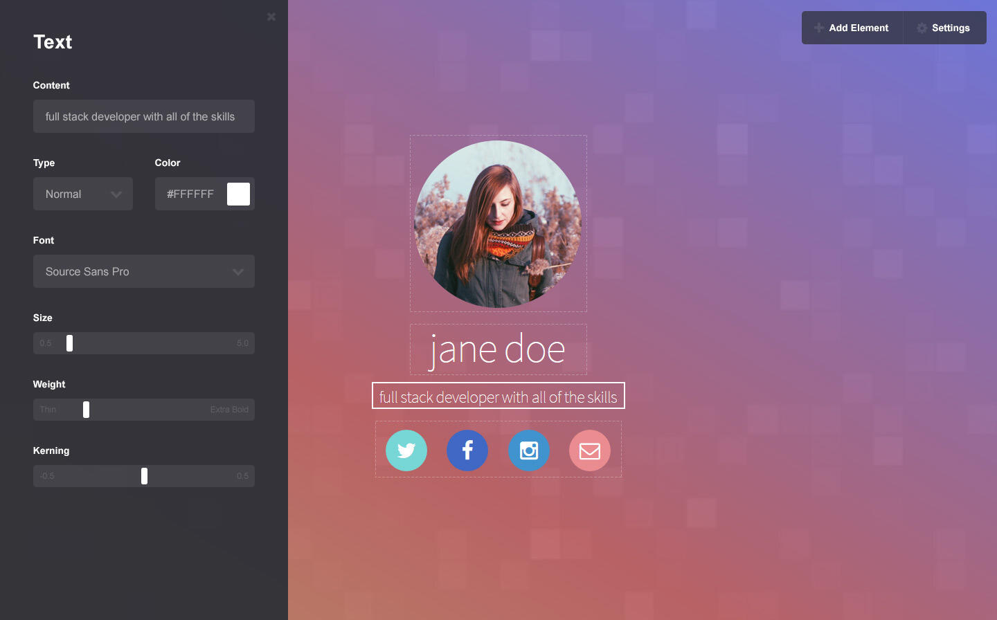
Granted it still needed a ton of work, but a few months and iterations later I hit on something that seemed to strike the right balance (and, as it turns out, very closely resembled what would become the final UI):
Next up: bringing this all to the browser.
Putting Pixels to Code
Anyone familiar with my work will know I have a thing for coding stuff from scratch (or at least as close from scratch as possible), so my frontend stack ended up looking like this:- Vanilla JS. Yup, plain old JS, but helped in part by ...
- jQuery. I wasn't in the habit of using everything jQuery had to offer, but I knew its DOM manipulation and event handling capabilities would be indispensable for something as complex as the Builder.
- Skel. Specifically for its JS (Skel.js) and Sass (Skel.scss) components. Skel provided tools for dealing with responsiveness and general cross-browser weirdness, and given that mobile-friendliness was one of my goals these would absolutely come in handy. PS: One of my own side projects.
- jquery.touch. For managing all manner of complex pointer/touch interactions like dragging and dropping. Again, another one of my own projects, and one that evolved so much through my work on the Builder that it actually reached a full 1.0 release (with, I might add, a crapload of new features 😁).Now, why take this minimalist, plugin-less(ish), framework-less approach to a project that would obviously be better if I used $frameworkName? Well, personal preference aside, I did have a few good reasons:- It allowed me to adapt to the specific needs of the Builder vs. having to adapt the Builder itself to the specific confines of a particular framework. This allowed me to craft a very lean, form-fitting custom solution with almost zero bloat.
- From the user's interactions with the Builder to the Builder's own interactions with the backend, I literally knew where everything was and, more importantly, how everything worked. This made it incredibly easy to not only track down and fix bugs, but also seamlessly add new features without the need for nasty hacks/kludge.
- And last but certainly not least, it forced me to learn stuff I'd otherwise have left to a built-in framework feature, a plugin, or an external library. For example, I had no idea how to build a color input, nor had I ever built an image upload input (let alone one capable of interactively cropping an image), but having no other choice but to learn I pushed on and, slowly but surely, got the job done while learning a shitload in the process.So in retrospect, I can safely say this approach served me exceptionally well on this project, and while I wouldn't recommend it for every project, I do recommend trying it at least once — if only just to see what's possible without a frontend framework.
The Finished Product
Finally, after months of intense development and testing, the Builder was finally done:
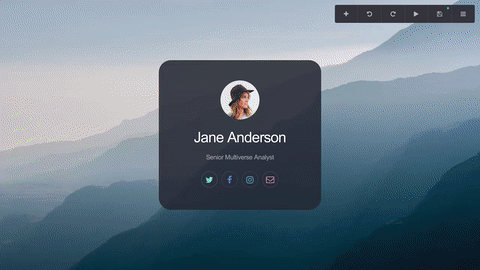
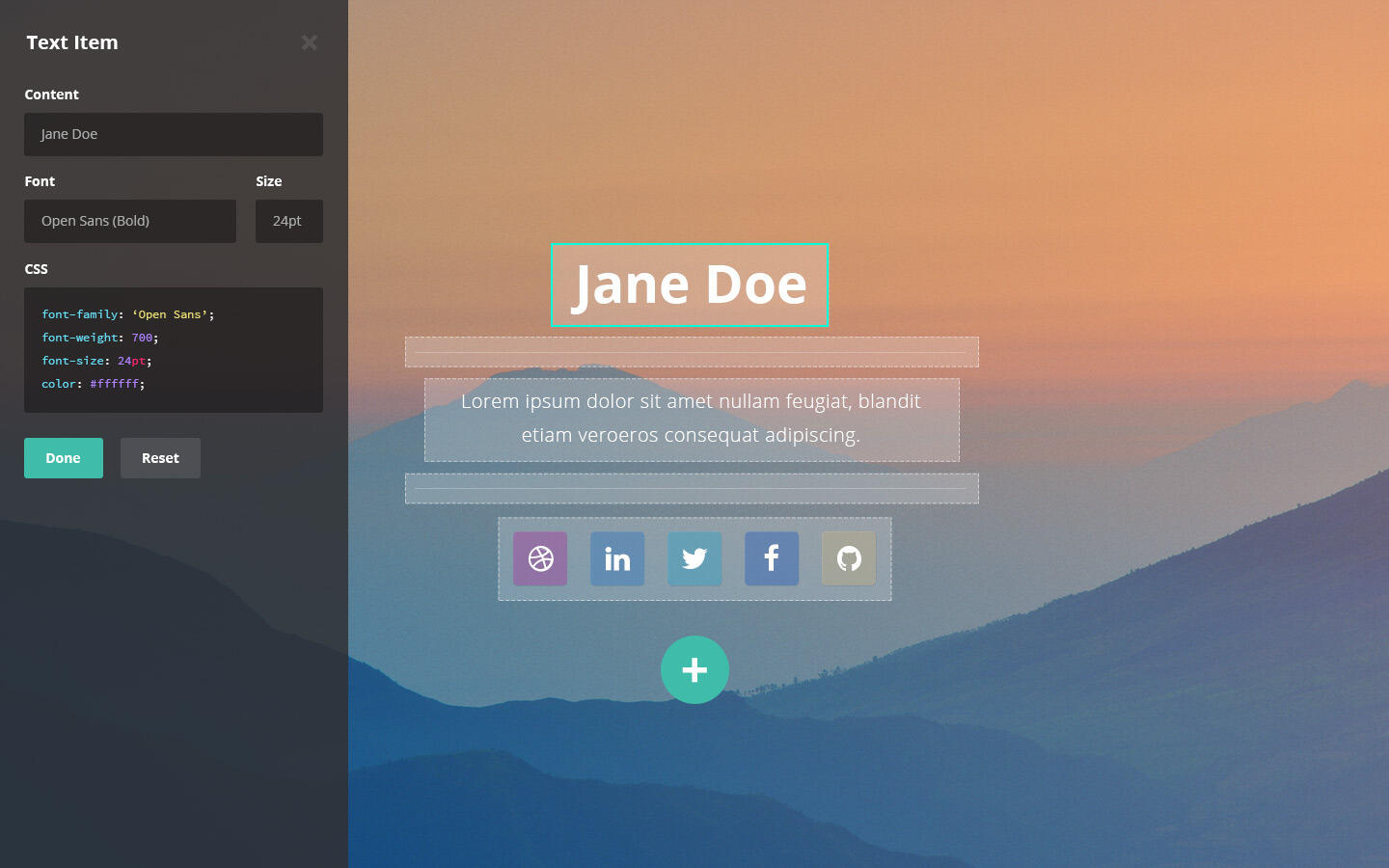
And not only did it perform spectacularly on all modern browsers (and even low-spec hardware), its UI had evolved into something that handily achieved all of my goals with just three elements:- The Canvas. A live preview of the site being worked on. Dragging and dropping elements rearranged them in the element stack, while clicking on them brought up their editable properties in ...
- The Panel. A simple, toggleable, general-purpose region docked to the side of the screen that served as the central location for all element/site properties and settings, keeping them all in one place and eliminating the need for additional panels or windows.
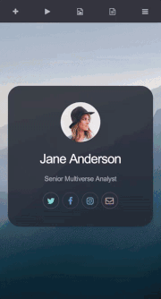
- The Menu. A low-profile toolbar with top-level buttons for primary actions (like "Add Element"), and a menu for accessing secondary ones (like "Help"). This kept the most frequently used actions readily accessible while hiding away everything else.... which all came together in a package that was minimal, zippy to get around, and even translated well to smaller screens:
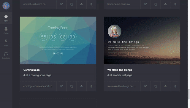
The Dashboard
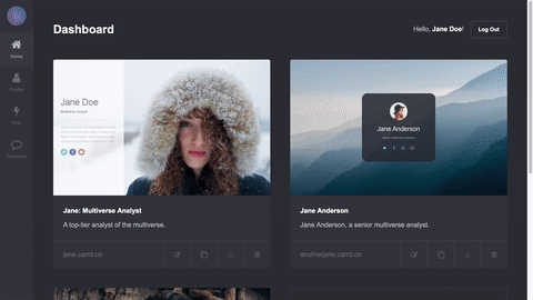
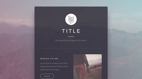
Compared to what I had just gone through working on the Generator and the Builder, the Dashboard was, comparatively speaking, an absolute breeze. However, that's not to diminish its importance as it was still the "hub" that tied the whole experience together.So, much as I had done with the Builder, I once again put the focus on the sites themselves and designed the Dashboard's UI around big, auto-generated screenshots of each of the user's sites:
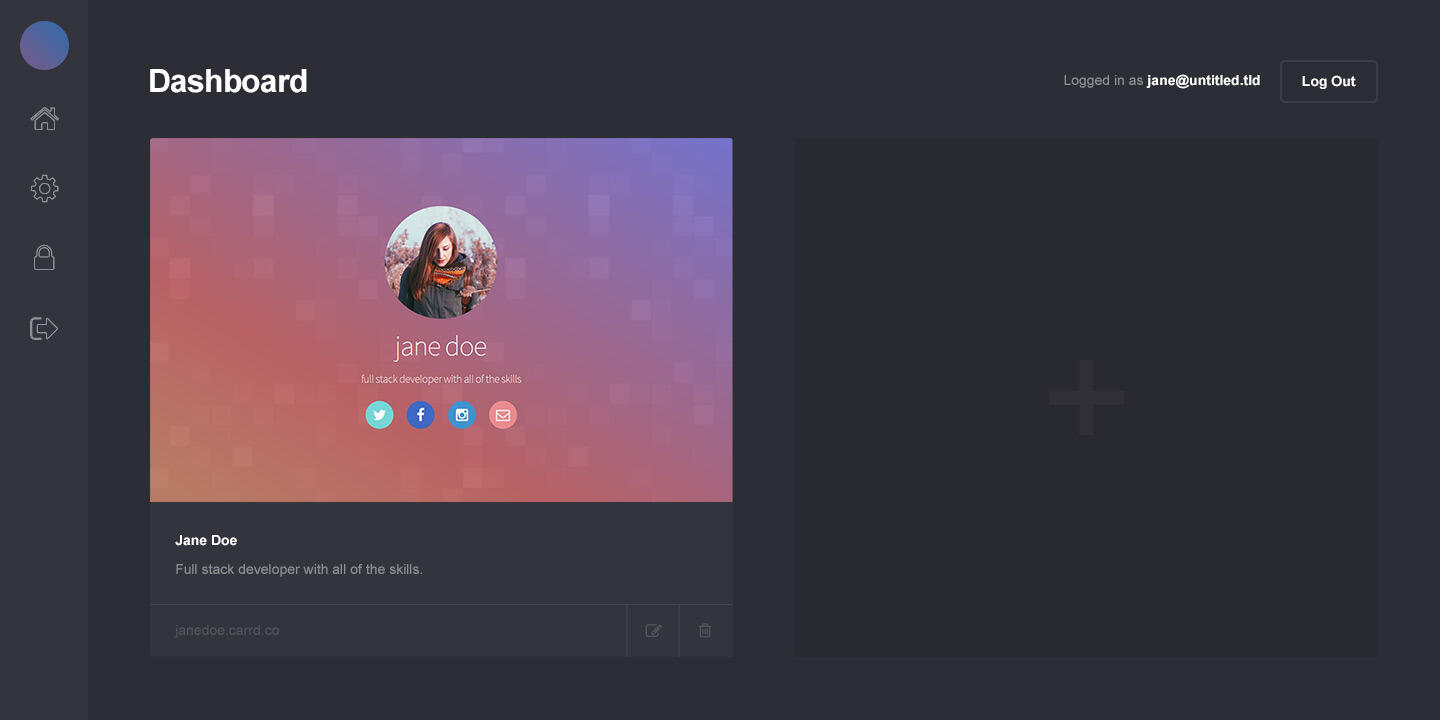
... and after about an hour of coding and testing, it was good to go:
The Site
Even after its launch, Carrd was going to remain in beta until all the major features I had in mind were implemented, so as far as the actual site went all I really needed (at least for the time being) was a basic landing page, a contact page, and maybe a few secondary pages for legal stuff.Of course, given the fact that both the Builder and the Dashboard already defined a pretty sizable chunk of Carrd's aesthetic, beyond designing a logo there really wasn't much left to do here 😛Still, I'll take any opportunity to play around in Photoshop so I went ahead and did a few mockups anyway:
... and within a few hours both my landing page and secondary pages were up and running.
The Paid Plan
Despite knowing I'd launch Carrd with some kind of paid plan, I elected to leave all planning and development to that effect until the very end so I could focus my efforts on finishing the core product, at which point I could then sit back and determine which features would remain on the free plan, and which made sense to migrate to paid plans.And so, just weeks away from launching, I began work on this final subproject.
The Perks
First, I needed to figure out how to selectively grant and deny users access to specific features. Having just played the crap out of Fallout 4, the idea of adopting something along the lines of its Perks system made a lot of sense; that is, a certain feature (say, the ability to use a custom domain) would be tied to a perk, and only users with that specific perk would be able to access that feature.This gave me a ton of flexibility. A "plan" could simply be a collections of perks, so if I ever needed to modify a plan, or even add a new plan, I'd only be dealing with easily-manipulable lists of perks (as opposed to a mountain of plan-specific conditionals buried deep within my code).Perks could also be assigned individually, meaning if I were, say, working on a new feature I wanted a particular group of users to test, I could simply move it behind a perk and manually assign that perk to each of them (something I would later do for the now-completed Columns element).
Planning the Plans
Okay, so I now had my perks system and a way to set up plans. The question now was what plans, and at what price?Before attempting to answer those questions, I established two things:- While the paid plans needed to be compelling enough for users to upgrade, I absolutely did not want it to come at the expense of severely crippling the free plan.
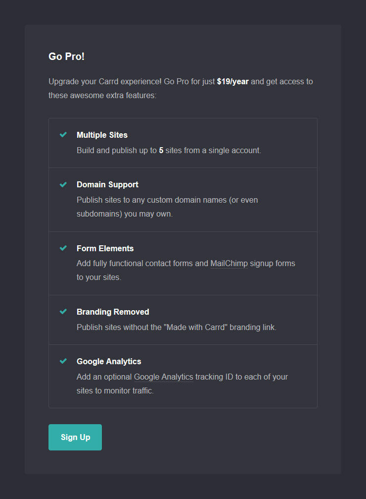
- All plans would be priced yearly. Monthly is generally an easier sell (lower price + smaller commitment), but I figured the last thing anyone wanted was yet another monthly service to keep up with. Plus, I figured if I priced my plans affordably enough, the yearly commitment wouldn't be that big a deal.Now, what would these plans look like? Well, given the fact that Carrd was still a new product, I didn't feel there were enough "premium features" to justify having multiple paid plans so I settled on starting with just one: Pro. And this Pro plan would include the following perks (among others I'd later add):- Use custom domains. This alone was a compelling enough reason to upgrade, though it should be noted this only granted the ability to use custom domains; the domains would still have to be registered and paid for at an actual domain registrar.
- The "Form" element. The recently-completed Form element allowed users to build fully functional forms (initially just "Contact" and "MailChimp Signup") — something that definitely felt "premium" enough to go into this plan.
- Build more sites. The free plan was limited to building just a single site per account (later increased to three), so raising this to five (and later, ten) seemed like an obvious perk to include.
- No "Made with Carrd" branding. All sites built with Carrd carried a small, unintrusive "Made with Carrd" link at the very bottom, so yet another obvious perk was to simply remove this from all Pro plan sites.Finally, how should this be priced? Competing products ranged anywhere from as little as $20/year to upwards of $250/year and were all over the map in terms of features.Well, since Carrd wasn't exactly meant for building big, complex, multi-page sites, it obviously didn't make sense to price it on the high end. At the same time, however, the fact that Pro didn't include a free domain (as was the case with some of these other products) meant the mid end wasn't a good fit either.So I settled on the low end, and ultimately went with a price I felt was fair for what Pro offered: just $19/year.And now, the not-so-fun part.
Programming the Payments
Yup, it was time to actually write the code to make payments and subscriptions a reality. I knew going in this would be tedious, test-heavy, and definitely nowhere near as stimulating as working on stuff like the Builder — which of course is ironic since this is literally the thing that makes the money.But incessant whining aside, it had to be done. And thankfully, I had a secret weapon to help get me through it: Stripe.

I had previously used Stripe to handle credit card payments for Pixelarity and my experiences with it were positive to say the least. Having tried numerous payment solutions in the past, Stripe was hands down the best of the bunch thanks in large part to its well-documented, developer-friendly API. The fact that it also supported subscriptions — an absolute necessity for a product like Carrd — meant using it was a total no-brainer.

Of course, that's not to say implementation was easy. From figuring out contingencies to all the stuff that could possibly go wrong during the course of a subscription to ensuring both Carrd and Stripe were properly communicating with each other if/when shit went sideways, it was ... educational to say the least.Still, I persisted, and after hours of testing (and as many cups of coffee), Carrd Pro was officially a reality, and Carrd itself was ready to launch.
Note: Later I would actually make subscriptions optional, allowing users to upgrade to Pro by way of a one-off payment via credit card or PayPal. This opened the door to a ton of users who were interested in Pro, but either preferred PayPal or simply weren't cool with having their credit card details on file somewhere.
And with that, Carrd was done!(well, at least done enough 😅 )
The Launch
AT LAST.After a year of planning, designing, coding, and what felt like a billion hours of testing, it was finally time to launch this thing 🚀

DRAMATIC REENACTMENT
On Twitter
So on March 7, 2016, I excitedly launched Carrd via Twitter:

And the response was amazing. New sites, new users, and even Pro upgrades began pouring in immediately — almost entirely without issue!Well almost:

... but minor screwups aside, the launch went as smoothly as I could have hoped and not only got Carrd off to a nice, strong start, but also kicked off a steady flow of feedback, feature requests, and bug reports that continue to improve Carrd to this day. In short, it was a total success 😄Of course, the whole launch thing wasn't quite over yet ...
On Product Hunt
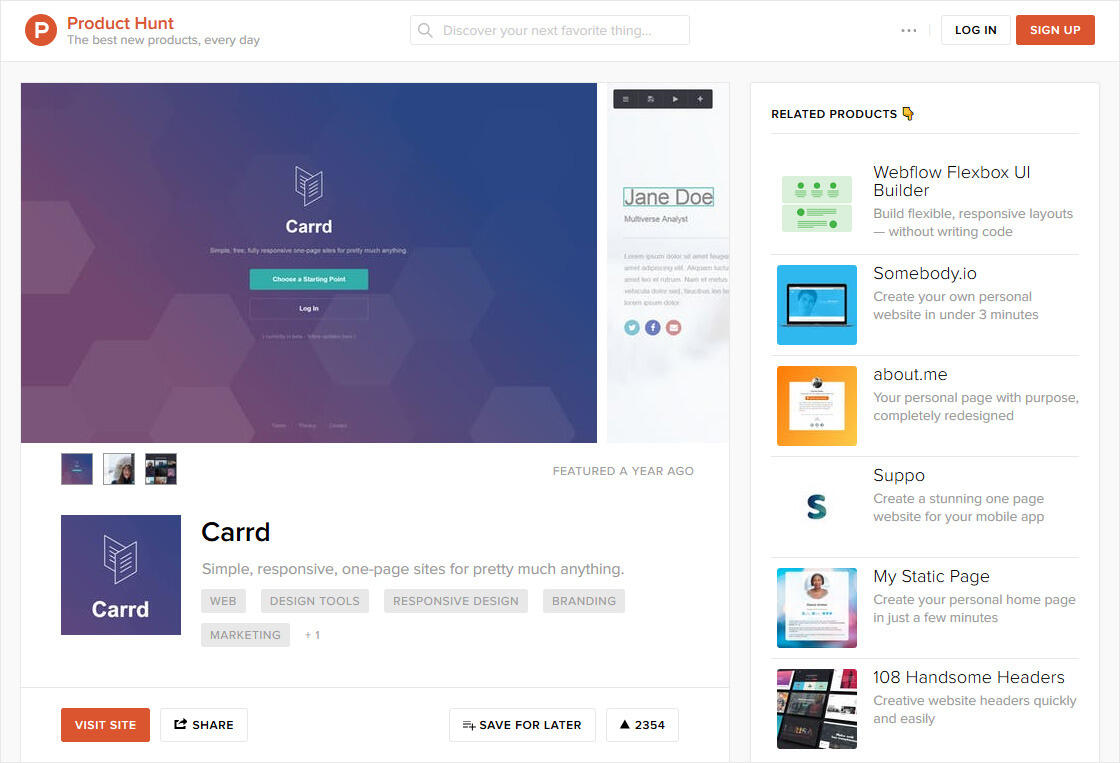
As a huge fan of Product Hunt, I had always planned on hunting Carrd following its launch on Twitter. However, on March 1, 2016, just days before it was set to go public, one of my followers kinda sorta jumped the gun and got there first:

(@n33co = my old Twitter username)
... which, don't get me wrong, I definitely appreciated, but with Carrd being little more than a "Coming Soon" page at that point, I suspected that might affect its chances of getting featured 😅Still, I was hopeful that wasn't the case, and figured in the meantime I could at least let my followers know it was up there in case they wanted to check it out:

And then, on March 16, 2016, this happened:

Ohhhhhhh shit.😲😲😲😲😲😲If new sites and users were "pouring in" following Carrd's launch on Twitter, this was, comparatively speaking, a tidal wave:- Thousands of new sites and users — thanks in large part to that "no signup required" experience I was so set on implementing.
- Hundreds of upgrades to Pro.
- A flood of user feedback, feature requests, and, of course, bug reports 😅
- And last but certainly not least, 1000+ upvotes and the #1 spot in tech for that day.So yeah, basically this:

Clearly, as well as the Twitter launch went, getting featured on Product Hunt was on another level entirely, with an effect so strong it persists even to this day, feeding Carrd a daily, continuous stream of new users and new sites. I can safely say Product Hunt played a huge role in getting Carrd where it is today, so I'm incredibly grateful to Ryan, Ben, Niv, and the entire Product Hunt team for creating the amazing product and community that made it all possible. THANK YOU! 🙏 🙏 🙏
Today
So, where does Carrd stand today (late March, 2017)?- 10,000+ sites (1,300+ of which are attached to a custom domain)
- 10,000+ users
- 900+ Pro upgrades
- 2,300+ upvotes on Product Hunt (apparently landing it a spot on the top 100 according to 500products.com 😄)And in the year since its launch, Carrd's added dozens of kickass new features (many as a direct result of user feedback), including:
Columns Element: Allows elements to be arranged side-by-side in up to 4 columns
Gallery Element: Creates a simple, lightbox-capable image gallery
Control Element: Simulates multiple pages with switchable "sections"

Timer Element: Creates a timer that counts down to (or up from) a specific date/time
Multi-level undo and redo (finally!)
Downloadable HTML, CSS, and JS for any site you create (requires Pro Plus)
... as well as tons of other additions and enhancements, like:- 30+ new templates.
- Full HTTPS for all sites (including those using custom domains).
- New elements like Table, Audio, and Video.
- Third-party and custom code support via the new Widget element.
- Hover effects for many elements.
- SVG support.
- Favicon support.
- Markdown improvements.
- PayPal support.
- Dozens of new customization options across the board.And much, much more. It's come a long way 😄
The Wrap Up
And that, my friends, is the whole story behind Carrd, from its conception all the way to its eventual launch and beyond.Carrd began as simply a way for me to do something different, but it ended with not only the best work I've ever done, but also a figurative shitload of lessons learned. So, in no particular order, here are some of the more useful (and in some cases obvious) nuggets of wisdom I picked up along the way:- Don't try to do too much. Limiting Carrd's focus from the get-go — and more or less sticking to it — was ultimately the thing that made it feasible for one person to build something on this scale.
- Don't fixate on competing products. While I definitely needed to know what was already out there, solely thinking of Carrd in relation to its competitors would have boxed me in and made it harder to come up with a unique vision of my own.
- Stick to your vision but have some flexibility. Big change aside (ie. dropping Carrd's exclusive focus on profile sites), this still came up a lot. For example, I had a ton of users request support for multiple pages, and while this obviously didn't mesh with my vision for a one-page site builder, I gave it some thought and actually came up with an alternative (the Control Element) that not only satisfied those users, but also extended the product in an unanticipated but incredibly useful way.
- Don't force users to sign up just to try your product. Obviously not feasible for every product, but I figured out a way to make it happen for Carrd and it absolutely paid off (especially following its feature on Product Hunt).
- Plan away from the screen. Since I generally spend the better part of each day in front of glowing screens of various shapes and sizes, I opted to do the vast majority of Carrd's planning on paper and whiteboard. This change of context was not only healthy and refreshing, but also helped me think (and therefore plan) with much more clarity.
- Always test on real devices. That is, instead of simply relying on screenshot services and emulation. Not only was it important to actually experience Carrd on a real iPhone or Android device, there were also numerous platform-specific bugs/eccentricities that weren't at all apparent when I simply emulated stuff in Chrome.
- Twitter can be awesome. Yes, I know it has a reputation for being a shitshow from time to time, but it was absolutely invaluable both during and after the development process. My followers were not only an incredible resource for ongoing feedback, but also some of Carrd's biggest supporters once it finally launched. So to all of my amazing followers reading this: THANK YOU! 🙏🙏🙏
- Product Hunt is a force to be reckoned with. Carrd would absolutely not be what it is today had it not been for Product Hunt, so if you aren't already part of this amazing community, join it. JOIN IT NOW.
- HAVE FUN. Really! Sure, some aspects of Carrd were obviously less enjoyable to work on than others (... payments 😓), but overall I had an absolute blast building it and I'm pretty sure the product directly reflects that 😄
- And finally, if you, like I was at the start of all this, are currently eyeing that ambitious solo project of your own, here's my advice to you:

— AJ (@ajlkn)PS: Check out some of the notes and sketches I made while working on Carrd.PPS: And a small gallery of some of my favorite sites built with Carrd.
Extras: Notes
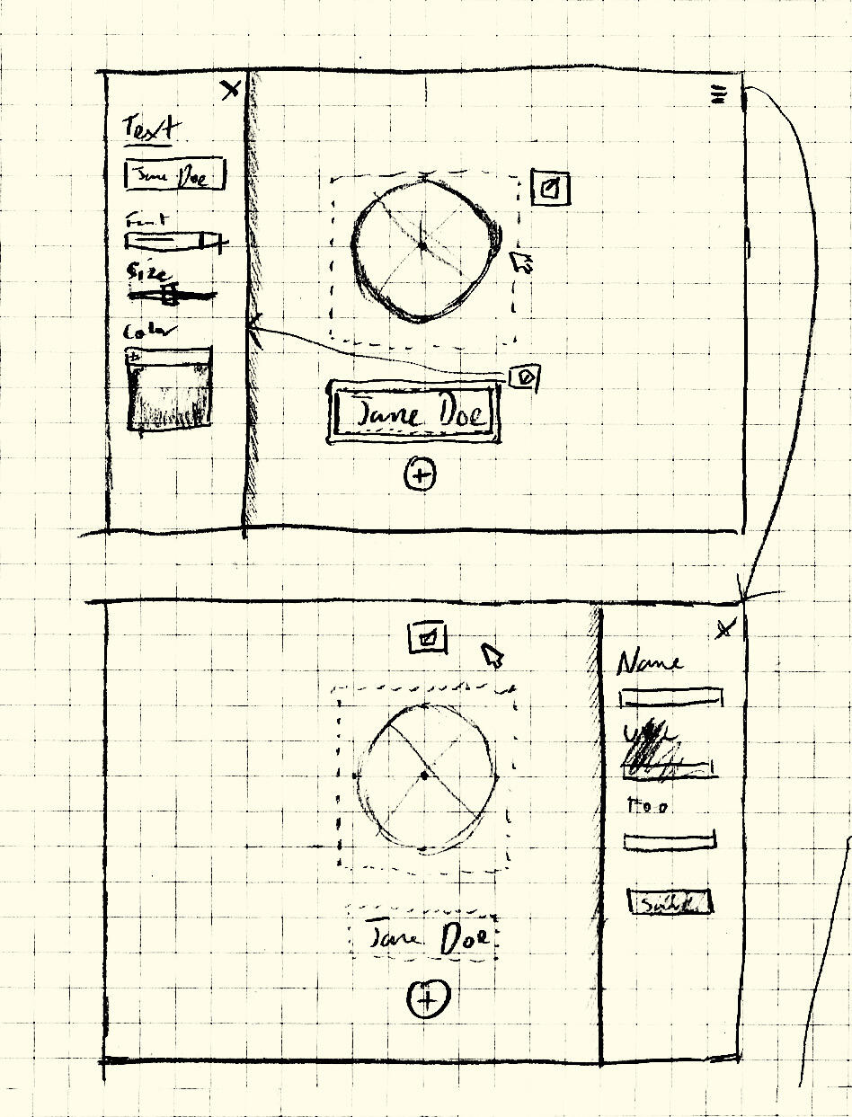
I made a ton of notes/sketches while working on Carrd, and as some of them are actually pretty interesting (particularly the ones that depict various features in their earliest stages of planning), I decided to put together a small, chronological collection of the more legible ones:
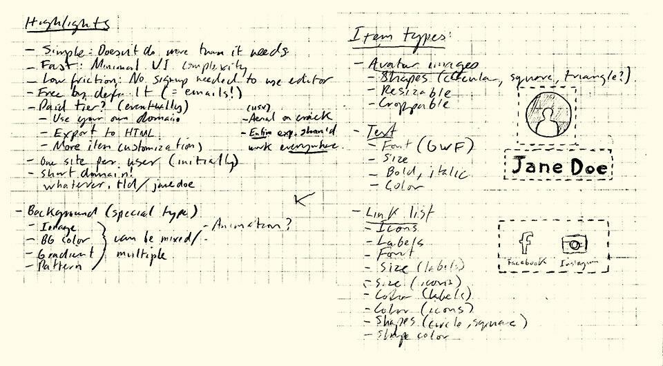
March 2015: Some of my earliest notes on what would eventually become Carrd. Note the "whatever.tld/janedoe" URL style I was considering at the time (before ultimately settling on the "subdomained" URL style).
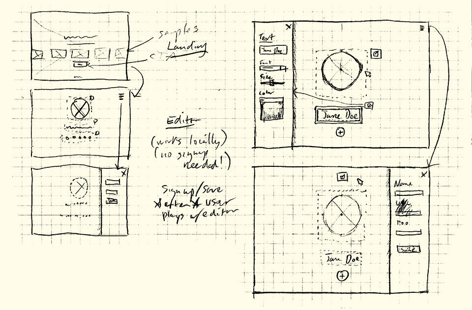
March 2015: A quick sketch of the "Editor" experience (later renamed to the "Builder"). Even at this very early stage, I had a pretty good sense of where I wanted to go with stuff.
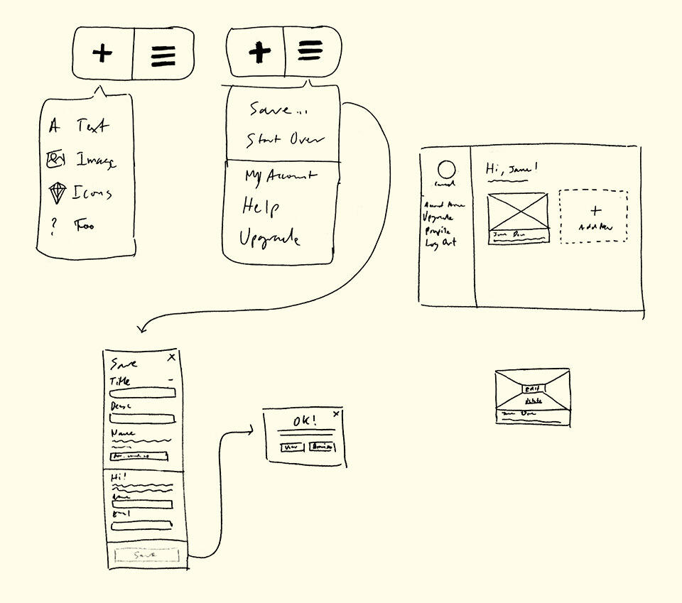
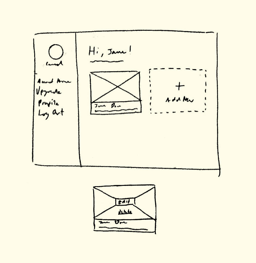
September 23, 2015: A few quick sketches I made while planning out the Builder's menu UI and "Save" (later renamed "Publish") flow, as well as the first wireframe of the Dashboard UI.
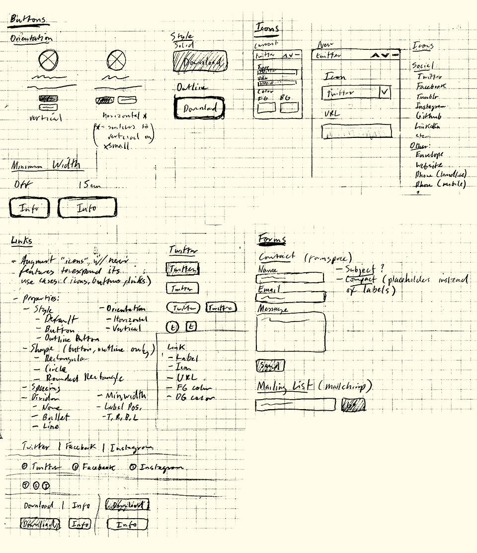
October 19, 2015: Plans for the Buttons, Icons, Links, and Form elements. The original Links element was to be, as you can probably tell, far more elaborate than what it is today.
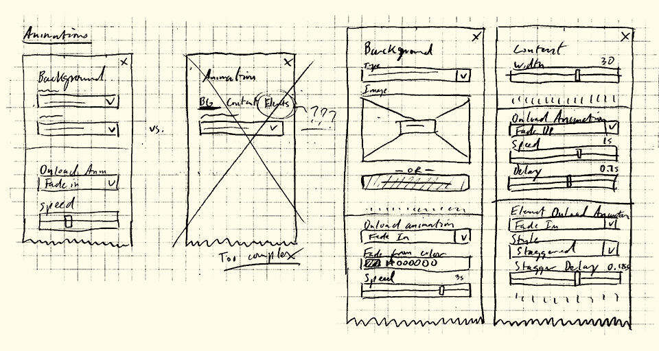
October 19, 2015: Plans for background and content animations. I wasn't entirely sure if I'd support animations at launch (if at all), but my mind was promptly changed after a few quick experiments showed just how much of a difference they made.
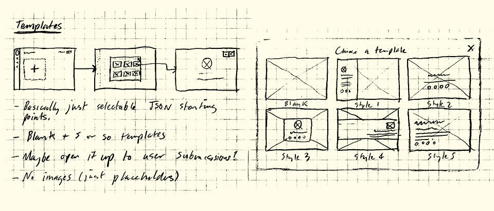
October 19, 2015: Early builds of Carrd lacked the "Choose a Starting Point" screen because this wasn't even something I originally planned on. It was only after the first beta that I realized most users, particularly those who weren't in any way design-savvy, would have literally no idea where to start if simply handed a blank canvas (which was my original plan).
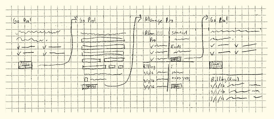
March 1, 2016: Plans for the Pro signup flow, which I hastily mapped out and implemented less than a week from launch.
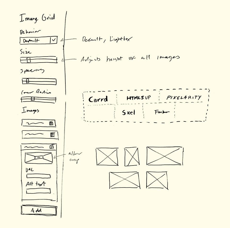
April 19, 2016: Plans for the Image Grid (later renamed "Gallery") element. One of my first additions to Carrd following its launch, and one prompted in part by my desire to port my own personal site to Carrd (hence the "Carrd", "HTML5 UP", etc logos).
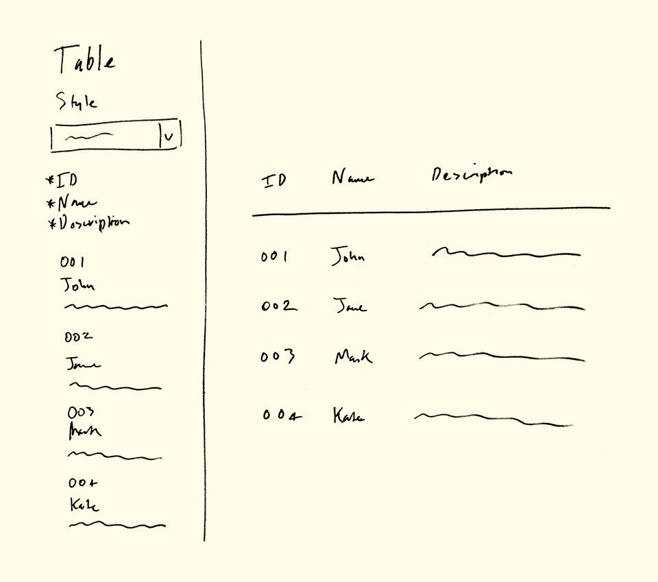
April 19, 2016: Plans for the Table element. Another early addition to post-launch Carrd that actually came about after I observed users attempting to simulate tables using nothing but text elements (with not so great results).
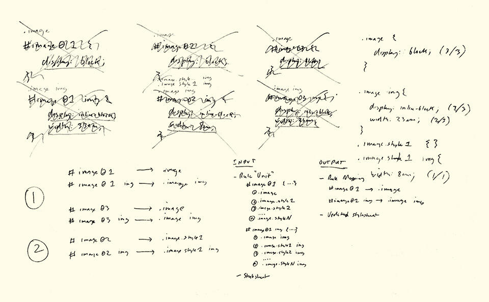
April 25, 2016: Some of the (many) notes I made in my attempts to rewrite Carrd's CSS optimizer. Due to numerous bugs/inconsistencies with my original optimizer (ie. it was overambitious and honestly kind of shit), I had to strip out all CSS optimizations prior to launch and have only recently begun to re-implement them (albeit far less ambitiously).
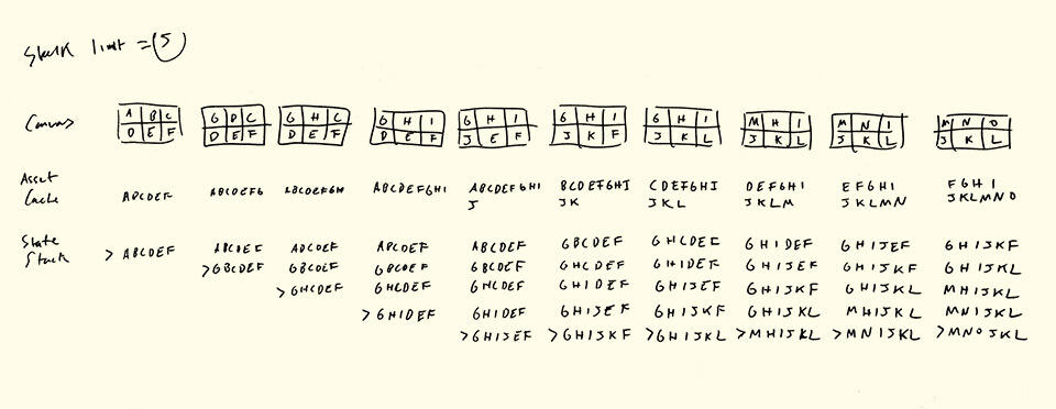
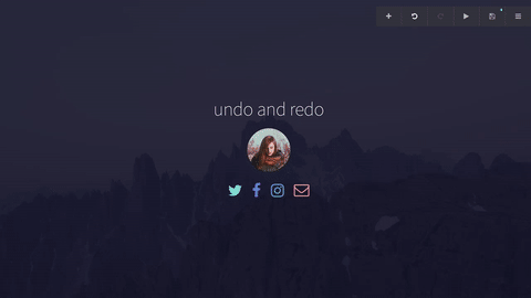
June 26, 2016: Notes I made while attempting to figure out multi-level undo/redo, which was challenging to figure out but surprisingly not all that hard to implement once I managed to wrap my head around it. What you see above — a walkthrough of how the asset cache changes from state to state — was one of my many attempts to get to that point.
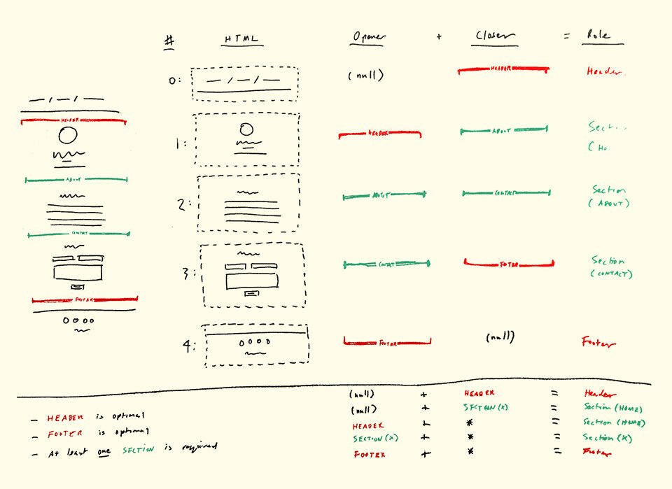
August 18, 2016: Plans for the Control element, which gave Carrd the (very significant) ability to simulate multiple pages by way of "toggleable" sections.
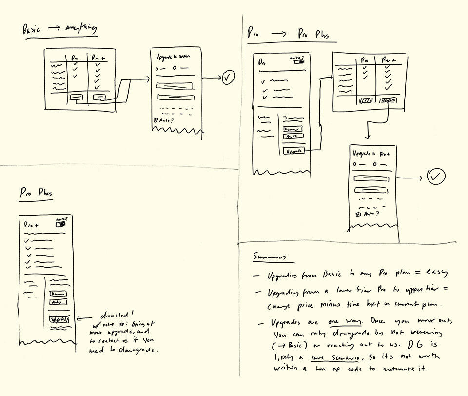
October 10, 2016: Carrd launched with just a single paid plan, and while the whole perk/plan thing easily supported multiple plans, the actual upgrade process didn't. So when the time came to add the new Pro Plus plan, I had to rewrite a good chunk of the upgrade flow to take into account all the stuff that came from having multiple plans (for example, existing users switching from one plan to another mid-cycle).
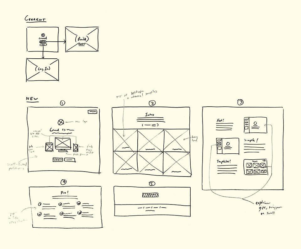
November 7, 2016: One of several ideas I've considered for Carrd's landing page experience once it's out of beta ... whenever that actually happens 😛
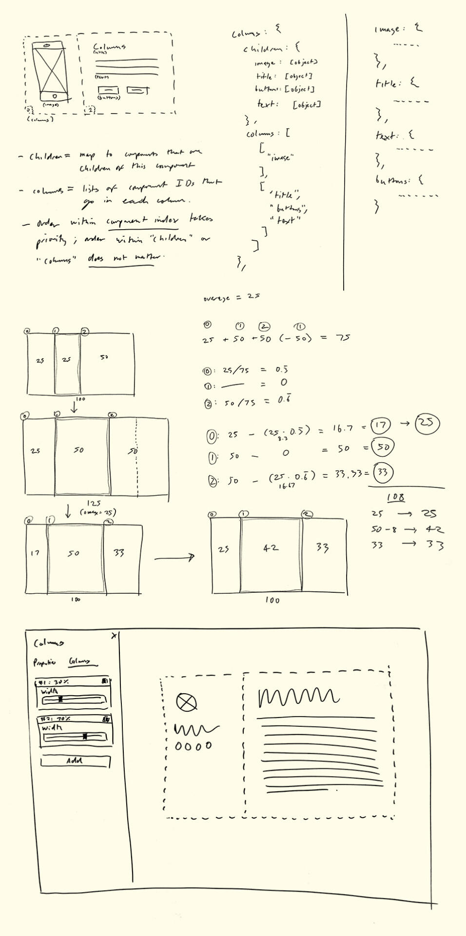
March 1, 2017: Just a small sampling of the planning that went into the Columns element, the biggest and arguably most significant upgrade to Carrd since its launch.
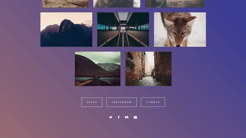
Extras: Gallery
Since Carrd's launch, I've had the pleasure of seeing users do some incredible and unexpected things with it. Here's a small sampling of some of my favorites from just the last few months (subject to grow):


